
CSSとアニメーションを使用して各文字を上から下へ1文字ずつ降ってくるアニメーションを作ります。
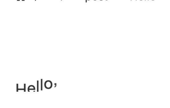
H
e
l
l
o
,
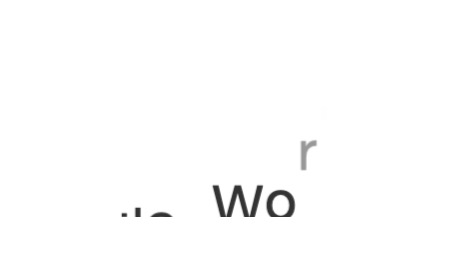
W
o
r
l
d
!
HTML部分を作成する
まずは、アニメーションの土台になるHTML部分を作成します。
<div class="animation-container">
<div class="falling-text">
<span class="letter">H</span>
<span class="letter">e</span>
<span class="letter">l</span>
<span class="letter">l</span>
<span class="letter">o</span>
<span class="letter">,</span>
<span class="letter"> </span>
<span class="letter">W</span>
<span class="letter">o</span>
<span class="letter">r</span>
<span class="letter">l</span>
<span class="letter">d</span>
<span class="letter">!</span>
</div>
</div>
CSS部分を作る
このCSSは、テキスト全体が上から下へ移動する fall アニメーションと、各文字がそれぞれ独立して同じく上から下へ移動する fallLetter アニメーションを定義しています。
<style>
        .animation-container {
            position: relative;
            overflow: hidden;
            height: 2em; /* テキストのサイズに合わせて調整 */
        }

        .falling-text {
            position: relative;
            display: flex;
            animation: fallLetter 2s linear infinite; /* アニメーションの持続時間を必要に応じて調整 */
        }

        .letter {
            display: inline-block;
            opacity: 0;
            transform: translateY(-100%);
            animation: fallLetter 2s linear infinite; /* アニメーションの持続時間を必要に応じて調整 */
        }

        @keyframes fallLetter {
            0% {
                opacity: 0;
                transform: translateY(-100%);
            }
            10% {
                opacity: 1;
                transform: translateY(0);
            }
            100% {
                opacity: 1;
                transform: translateY(100%);
            }
        }

        /* 各文字のアニメーション遅延 */
        .letter:nth-child(1) { animation-delay: 0s; }
        .letter:nth-child(2) { animation-delay: 0.1s; }
        .letter:nth-child(3) { animation-delay: 0.2s; }
        .letter:nth-child(4) { animation-delay: 0.3s; }
        .letter:nth-child(5) { animation-delay: 0.4s; }
        .letter:nth-child(6) { animation-delay: 0.5s; }
        .letter:nth-child(7) { animation-delay: 0.6s; }
        .letter:nth-child(8) { animation-delay: 0.7s; }
        .letter:nth-child(9) { animation-delay: 0.8s; }
        .letter:nth-child(10) { animation-delay: 0.9s; }
        .letter:nth-child(11) { animation-delay: 1.0s; }
        .letter:nth-child(12) { animation-delay: 1.1s; }
        .letter:nth-child(13) { animation-delay: 1.2s; }
    </style>
このコードでは、各文字に nth-child セレクタを使用してアニメーションの遅延時間を設定しています。
アニメーションの速度や他のスタイルは必要に応じて調整できます。
まとめ
これにより、各文字が異なるタイミングでアニメーションを開始し、1文字ずつずらして動く効果が生まれます。アニメーションの速度や遅延時間などを調整して、望む結果に合わせてください。